All case studies Next: AI credit scoring for SMEs

UX Design & Research · AZA Finance

Simplifying onboarding Journey using open source API

Africa's largest non-bank currency exchange was losing new business customers before they ever transacted. I redesigned the sign-up journey end to end, and used a company-registry lookup to delete the slowest part of it.

UX Designer & Researcher  ·  Jan – Aug 2022  ·  AZA Finance (formerly BitPesa)

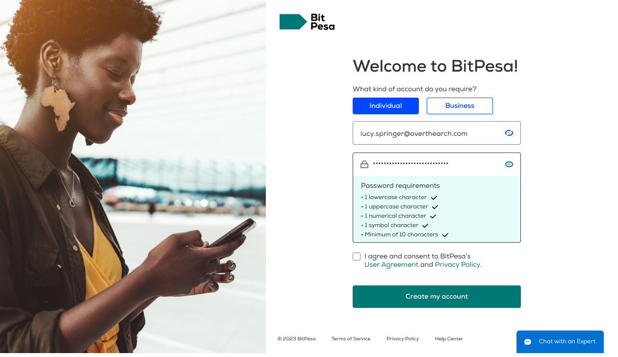
AZA Finance sign-up screen: a new user chooses an individual or business account, enters an email address, and sees live password-strength checks.

Outcome

50%

Faster onboarding, from account creation to first transaction

20%

Increase in user satisfaction with the sign-up experience

$100K

Estimated annual cost saving from reduced manual verification

The redesigned flow also carried 35% fewer screens than the one it replaced, while telling the customer more at each step.

Onboarding time and satisfaction measured post-launch against the pre-redesign baseline. Cost saving estimated from operations hours removed from manual company verification.

My role
UX Researcher & UI Designer
Company
AZA Finance (formerly BitPesa)
Timeline
Jan – Aug 2022 (8 months)
Tools
Figma · FigJam · UserTesting · Zoom

What I designed

Stakeholder and customer research, journey mapping, information architecture, interaction design for every state including the failure states, high-fidelity UI, prototyping, and two rounds of usability testing with the iterations that followed.

Every screen, sequence and word in this case study was a design decision.

What the API did

One thing: given a country of incorporation and a registration number, it returns a legal entity from the public company registry.

I did not build the integration. I found the opportunity in research, argued for it, and designed the experience around it — including what happens when it returns the wrong company, or nothing at all.

Discovery

Why 40% of new customers left before finishing sign-up

I ran stakeholder interviews, an analytics review of the existing funnel, and research sessions with new and existing corporate customers. Five points of friction came up repeatedly.

Over 40% of customers who started onboarding abandoned before completing verification — lost revenue on acquisition spend that had already been paid.

  • KYC requirements were never stated up front. Customers found out which documents they needed halfway through the flow.
  • No progress indicator anywhere. No sense of how far along they were, or how much was left.
  • Upload errors surfaced only after submission, by which point the customer had already left.
  • Compliance language was written for compliance, not for the person reading it.
  • No save and return. Stopping meant starting over.
bitpesa.co/onboarding/business-verify Upload Certificate (.pdf) Max file size 5MB Submit 1 5 Unlabelled Steps 2 Endless Single Column No grouping, high fatigue 3 Manual Doc Upload Causes 40% verification drop-off
bitpesa.co/onboarding/business-verify?submitted=1 4 errors in your submission Your documents did not satisfy AML/CFT source-of-funds criteria. Invalid format Required Upload failed — file exceeded 5MB Please re-upload all documents Your progress on this application has not been saved. Start again from step 1. Start over 4 Errors Only After Submit Validated server-side, never inline 5 Compliance-Written Copy No plain-language explanation 6 No Save & Return Stopping meant starting over
The legacy business verification screen and its post-submission error state, annotated during the audit. Company policy means the pre-redesign product can only be shown as wireframes.

Definition

Two people were signing up, and only one of them was being designed for

The flow assumed a single technically-confident user. In practice the account was usually opened by a business owner or finance manager, and connected later by someone else entirely.

Business owners

Need to know what's required before they start, where they are in the process, how long it will take, and that their documents are secure.

Technical integrators

Need to connect existing systems without deep developer knowledge, with plain-language documentation available alongside the flow rather than elsewhere.

Job to be done

"When I sign up to AZA, I want to finish in one sitting, so I can start transacting without chasing support."

Design decisions

Six decisions that rebuilt the journey

Each one below shows the problem it came from, the insight behind it, and the screen it produced. Select any screen to view it full size.

01

Ask the account-type question first, not last

Problem

Account type was inferred late in the flow, and password rules only appeared as an error after submitting. Customers who guessed wrong went back to the beginning.

Insight

Individual or business determines every screen that follows. It is not a detail to collect along the way — it is the first question.

Design response

One entry screen: account type as an explicit two-option choice, then email and password with all five requirements visible and resolving live as you type.

Why it worked

Nothing is rejected after submit. The customer sees the rules being met before they commit, and lands in the right branch of the flow first time.

Account creation. The five password rules tick off as they are satisfied, rather than appearing as a red error afterwards.
02

Replace a form and a document upload with two fields

Problem

Customers typed their legal name, incorporation details and company type by hand, then uploaded a certificate of incorporation for a human to check against what they had typed.

Insight

All of that data already exists in public company registries. We were asking the customer to re-key information we could look up, and then paying someone to verify their typing.

Design response

Country of incorporation, a yes/no on whether that is also the trading country, and the registration number. The registry lookup fills in the rest.

Why it worked

A multi-field form plus a document upload plus a manual review collapsed into three inputs — and the data that comes back is authoritative rather than self-reported.

Company search. The trading-country question is asked here because it changes which compliance path the account takes later.
03

Let the system propose and the customer confirm

Problem

An automated match is not automatically the right one. Registered names are near-identical across related entities, and onboarding the wrong legal entity is expensive to unwind at compliance.

Insight

Automation earns trust by being checkable. The customer is the only person who knows which entity is theirs, so the confirmation must be a real decision, not a formality.

Design response

One checkpoint showing the returned legal entity, with rejecting it given its own visible control rather than hidden behind a back button.

Why it worked

Wrong matches are caught in the second they happen, by the one person who can catch them, at a cost of one tap.

Confirmation. "This is not my company" sits directly under the result, where a customer who spots the error is already looking.
04

Design the failure state as part of the feature

Problem

Lookups fail — UK branches of foreign companies, recent registrations, registries we don't cover. Automation that only works when it works pushes the hardest cases into support.

Insight

The customers most likely to fail the lookup are often the more complex, higher-value accounts. The fallback is not an edge case; it is a segment.

Design response

A plain statement that we couldn't find them, the legal name field pre-filled with what we do know, and the same two buttons continuing the journey. No apology, no dead end.

Why it worked

A failed lookup costs the customer one field instead of a support ticket and a wait.

Fallback. Same layout, same buttons, same position on the page as the success state — so the recovery doesn't feel like a punishment.
05

Give the unavoidable form a shape

Problem

What the registry can't supply — trading address, business activity, expected volumes, due-diligence answers — arrived as one long undifferentiated column of fields.

Insight

Length wasn't what people objected to in testing. Shapelessness was. A form you can see the end of is a different experience to the same form without headings.

Design response

Four named groups — contact details, trading address, what the business does, due diligence — in a two-column grid, with contact details split onto its own short screen and optional fields labelled as optional.

Why it worked

The same information, in sections a customer can scan, judge and pause between — and hand to a colleague who owns one of them.

The full business profile, grouped under four headings.
Contact details on its own screen — five fields, one of them marked optional.
06

Carry the progress model into the first transaction

Problem

Onboarding isn't finished at verification. It's finished at the first transaction — and that ran across five unlabelled pages with no indication of what remained.

Insight

The moment a first-time customer is most likely to hesitate is the moment they are about to move real money. Uncertainty about the number of remaining steps reads as uncertainty about the product.

Design response

A five-step breadcrumb naming every stage, with the rate shown inline between the two amount fields and thresholds explained where they apply rather than after submission.

Why it worked

The customer always knows what's left, and finds out that a transaction needs trading-desk approval before entering it, not after.

Request a rate. The over-the-counter threshold notice appears the moment the amount crosses it.

Testing

What two rounds of testing changed

Round one used a mid-fidelity prototype with internal stakeholders. Round two put a high-fidelity interactive prototype in front of small business owners and finance managers.

Three findings changed the design:

  1. Participants kept missing the document checklist when it sat inside the flow, so it moved to a dedicated screen before the flow begins.
  2. Uncertainty about review timelines came up in every session, so each major section now ends with a plain "what happens next".
  3. Less technical participants found the API credentials screen intimidating, so it was simplified and moved out of the critical path.

Reflection

The fastest step is the one you remove

The single largest gain in this project didn't come from a better form. It came from research showing that a whole stage of the journey — typing company details and uploading a certificate for someone to check — didn't need to exist.

The work that made it usable was everything around it: the confirmation, the fallback, the wording, and the decision about what to do when the automation is wrong.

Sign in, for everyone who has already been through all of the above.

What it left behind

A reusable component library for the AZA web platform, built out of these screens, which shortened build time on every product project that followed.

All case studies Next project → AI credit scoring for SMEs

Like what you see?

Let's work together

A simple hello could lead to a life-changing conversation. A shared experience could spark a revolutionary idea. The possibilities are endless, so let's connect and see what happens!

Email me LinkedIn
{{ shotImg }}

{{ shotCap }}